From Screen to Unboxing: 2026 Jewelry Packaging Trends for E-Commerce Brands

For an e-commerce jewelry brand, packaging now has to perform before the customer touches it. It appears in product photographs, short videos, launch content, packing clips, customer posts, and finally in the unboxing itself. A box can be well made and still feel forgettable online if the jewelry is difficult to see, the opening sequence is unclear, or every layer competes for attention.
This is why the most useful jewelry unboxing trends in 2026 are not simply new colors, materials, or box shapes. They reflect a shift toward packaging that reads clearly on a screen, holds the product in a controlled position, opens naturally in real hands, and creates one recognizable brand moment without adding unnecessary complexity.
The goal is not to design packaging only for social media. It is to make the physical customer experience clear enough that it also communicates well through a camera.
The Trend Is Moving From a Single Box to a Visible Sequence
Traditional retail packaging is often judged at a counter, where the customer can see the material, feel the weight, and watch a sales associate present the product. E-commerce removes that context. Before purchase, the customer may only see a thumbnail, a product-page image, or a few seconds of video. After purchase, the package must create the presentation moment at home.
Industry reporting on 2026 packaging trends increasingly treats the product page, delivery package, and unboxing as connected parts of one experience. For jewelry brands, that connection is especially important because the product is small. The packaging controls scale, contrast, orientation, and the pace of the reveal.
A useful sequence may include:
- An outer protective package that arrives clean and opens without confusion.
- A presentation box or pouch that immediately feels connected to the brand.
- An insert or holder that keeps the jewelry correctly positioned.
- One card, message, or finishing detail that adds meaning without covering the product.
Not every order needs all four elements. The trend is toward intentional sequencing, not toward adding more components.
1. Screen-Ready Design Is Replacing Decoration for Decoration's Sake
Packaging used in e-commerce has to remain legible at several scales. A logo that looks balanced in the hand may disappear in a small product image. A complex pattern may look attractive in person but become visual noise in a thumbnail. Highly reflective foil can create a premium effect under controlled light while becoming difficult to photograph consistently.
Screen-ready packaging does not mean oversized branding. It means creating a clear visual hierarchy:
- The jewelry is visible first.
- The packaging shape and color support the product.
- The brand mark is recognizable without dominating the frame.
- Secondary information remains readable when the customer looks closer.
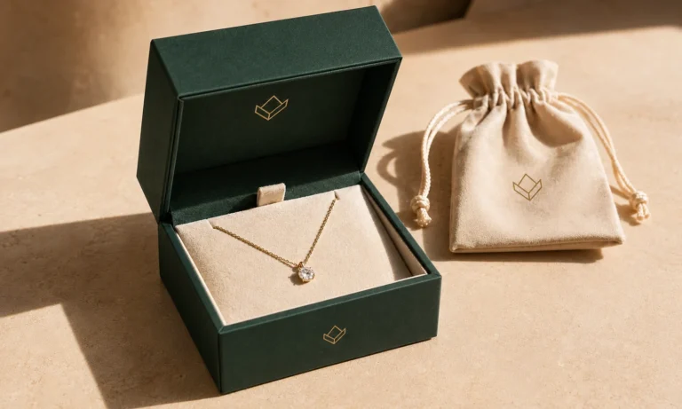
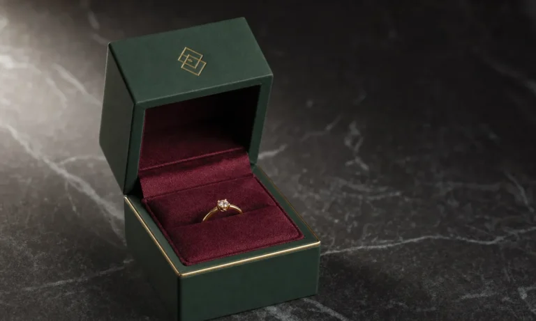
For many jewelry brands, one strong contrast is more effective than several decorative effects. A warm neutral insert can frame gold jewelry. A deep green or charcoal box can support a restrained foil or debossed mark. A tonal logo can work when material texture and lighting provide enough separation.
The correct choice depends on the jewelry finish, brand palette, photography style, and customer positioning. Before approving a design, buyers should review the package in a wide product image, a close detail photograph, and a small thumbnail. A full-size mockup alone does not show how the design will behave online.
2. The Opening Sequence Is Becoming a Designed Brand Asset
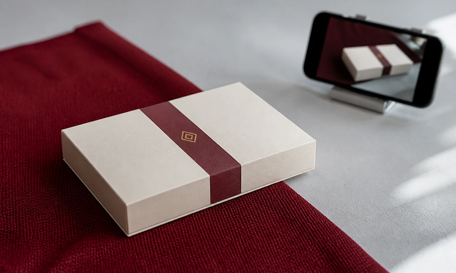
An unboxing video is a sequence rather than a still image. The customer sees the outside, finds the opening point, lifts or slides a component, and then views the product. Every movement affects whether the experience feels calm, awkward, excessive, or incomplete.
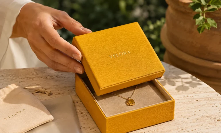
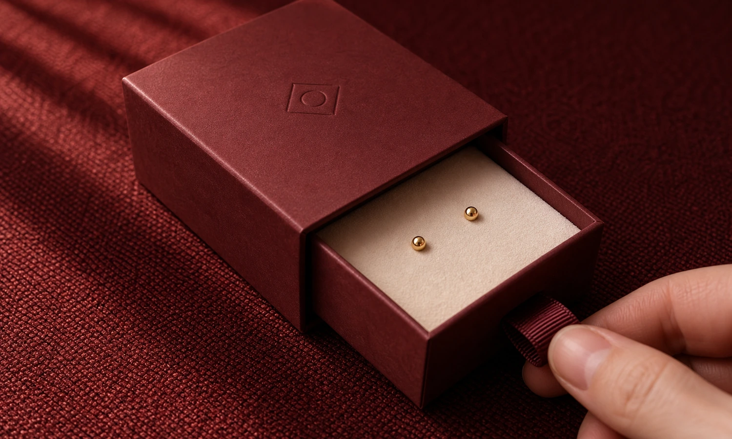
In 2026, the stronger direction is controlled simplicity. The opening method should be obvious enough for a first-time customer but deliberate enough to create anticipation. A drawer should slide smoothly without requiring two hands to fight the sleeve. A hinged box should remain stable when open. A removable lid should lift without sudden release. A pouch should open without forcing the customer to pull on the jewelry.
The most memorable packaging often contains one signature moment:
- A clean reveal when the lid reaches the correct angle.
- A well-fitted insert that presents the jewelry immediately.
- A subtle interior color change.
- A concise message placed where it appears after the product is secure.
- A small branded pull tab or ribbon that has a clear function.
Using several reveal devices at once can slow packing, increase inconsistency, and distract from the jewelry. A better question is not "How can we add more surprises?" but "Which moment should customers remember?"
3. Tactile Details Are Being Chosen for How They Look in Motion
Texture remains relevant, but its role is changing. The useful trend is not to cover every surface with a premium material. It is to choose a tactile detail that is visible when the package is handled.
A finely textured paper may catch side light as the box turns. A matte surface can reduce harsh reflections. A velvet or microfiber-style insert can create a soft visual field around the jewelry. A debossed logo may become visible as the camera angle changes. These details can communicate depth without requiring large graphics.
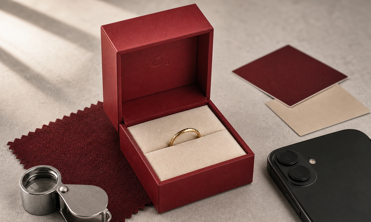
Material accuracy matters. Velvet, microfiber, faux suede, paper, fabric, and leatherette should not be treated as interchangeable labels. Each has different fibers, edges, color behavior, and production considerations. Buyers should review physical swatches and finished samples under the lighting used for product photography as well as under ordinary room light.
Texture should also support handling. A surface that marks easily, attracts visible dust, or changes appearance after repeated contact may create avoidable problems for packing teams and customers. The sample review should include normal opening, closing, wiping, and repacking rather than a single untouched photograph.
4. Compact Packaging Can Look More Intentional Than Oversized Packaging
Oversized packaging once offered an easy way to make a small product feel important. For e-commerce orders, however, an unnecessarily large box can create a weak visual relationship between the jewelry and its surroundings. It can also add packing volume without improving the reveal.
The stronger 2026 direction is right-sized presentation with a clear focal point. A compact ring box can feel substantial when the ring sits upright, the proportions are balanced, and the opening action is stable. A necklace box can remain slim when the insert controls the pendant and excess chain. An earring package can use a smaller card or pad if backs, hooks, and drop length are properly accommodated.
Compact does not mean minimal protection. The presentation package and outer shipping protection perform different jobs. The inner package should hold and present the product; the outer layer should manage transport risks. Buyers planning a complete system can review ElevenPack's Complete Packaging Solutions to consider how boxes, pouches, cards, tissue, and outer packaging may work together.
The key is proportion. The jewelry should not look lost, and the package should not need decorative filler simply to occupy empty space.
5. Product Fit Is Becoming Part of the Visual Story
An insert is usually discussed as a protective component, but it also determines what a camera sees when the box opens. A tilted ring, crossed pair of earrings, loose pendant, or tangled chain can weaken the presentation before the customer evaluates the material or logo.
For screen-to-unboxing consistency, the product should return to the intended position after normal handling. That requires an insert designed around the jewelry rather than a generic cavity selected only by box size.
Buyers should check:
- Whether the jewelry remains centered after the closed box is handled.
- Whether chains are controlled without sharp bends or difficult removal.
- Whether rings remain upright across the intended band and setting range.
- Whether earring posts, backs, hooks, and drops have sufficient clearance.
- Whether bracelets and bangles sit naturally without being forced into the insert.
- Whether the lid closes without pressing against a raised product.
The fit does not need to look mechanically perfect. It needs to appear deliberate and remain practical for the customer and packing team. For projects involving a new box and insert, review the available custom jewelry boxes as a system rather than selecting the exterior first and solving the interior later.
6. Brand Consistency Is Shifting From Identical Components to Recognizable Cues
A coordinated packaging system does not require every component to use the same color, material, logo size, and finish. Repeating every detail can make a set feel heavy and can increase the number of custom specifications that must be controlled.
The more flexible trend is to repeat a small number of recognizable cues:
- One primary brand color with a controlled neutral range.
- One logo treatment used consistently at appropriate scales.
- A repeated edge, shape, line, or opening detail.
- A stable interior presentation style across product categories.
- A consistent tone for care cards, thank-you messages, and product information.
This creates a visual family while allowing a ring box, necklace box, pouch, card, and outer mailer to do different jobs. It can also make seasonal updates more manageable. A collection may change the sleeve, card, ribbon, or accent color without redesigning the complete packaging system.
Before expanding the set, brands should define which detail customers should recognize when only one component appears in a photograph. That detail is often more valuable than making every component equally branded.
7. Packaging Is Being Designed for Real Hands, Not Only Styled Photographs
Some packaging looks convincing in a still-life image but becomes awkward as soon as someone opens it. A lid may block the product from a natural camera angle. A ribbon may cover the logo. A card may fall forward. A deep insert may require the customer to pull on a delicate chain.
A camera-ready unboxing still has to be a comfortable human interaction. During sampling, ask several people who were not involved in the design to open the package without instructions. Observe where they place their fingers, which side they turn toward themselves, what they remove first, and whether the jewelry remains visible.
Test the package in three realistic positions:
- On a table, viewed from the customer's seated or standing angle.
- Held in both hands, as it may appear in a short video.
- Opened inside the complete delivery package, with the actual protective layers.
The result should not depend on a professional stylist arranging every component. If a customer can open, understand, and present the product naturally, the packaging is more likely to work in both private and shared unboxing moments.
8. What E-Commerce Jewelry Brands Should Avoid in 2026
Trends are useful only when they improve the product experience or the buying process. Several approaches can look current in a concept image while creating practical problems.
Avoid designing only for the first photograph
The package should still work after it has been shipped, opened, closed, and handled. Review movement, marking, dust, alignment, and repacking.
Avoid reflective finishes without a photography test
Foil and glossy surfaces can be effective, but their visibility changes with light and angle. Test the actual size and placement under realistic photography conditions.
Avoid oversized layers that add no clear function
Extra sleeves, ribbons, cards, tissue, bags, and filler can make the reveal slower and less coherent. Every layer should protect, inform, organize, or reinforce the brand.
Avoid trend colors that reduce product contrast
A fashionable color is not useful if it makes the jewelry difficult to see. Review gold, silver, rose gold, gemstones, pearls, and dark finishes against the proposed interior.
Avoid a generic insert for multiple incompatible products
A universal interior may appear efficient but can create inconsistent presentation. Define the product range and test the most difficult variation before deciding that one insert is enough.
Avoid copying a viral unboxing format
A packaging sequence that works for cosmetics, apparel, or electronics may not suit small, delicate jewelry. Extract the principle—clarity, anticipation, contrast, or a recognizable gesture—then redesign it around the actual product and packing process.
A Sample Review Checklist for Screen-to-Unboxing Packaging
A digital mockup can establish direction, but it cannot confirm movement, reflection, texture, opening action, or product fit. Use a physical sample and record observations from both the customer's view and the camera's view.
- The jewelry remains the clear subject in wide images, close-ups, and thumbnails.
- The logo is readable at its intended size without overpowering the product.
- The opening point is easy to understand without instructions.
- The box, drawer, lid, pouch, or ribbon moves naturally in real hands.
- The jewelry stays aligned after the closed package is handled normally.
- The insert supports the product without making removal difficult.
- Materials and finishes photograph consistently under the brand's usual lighting.
- The package contains one clear signature moment rather than several competing effects.
- The components can be packed in a repeatable sequence.
- The presentation package works with the selected outer protection.
- The design still feels coherent after decorative components are removed.
- The final result supports the brand rather than imitating a short-lived visual trend.
When the sample needs to confirm product fit, opening action, material appearance, and the complete reveal, explain those goals in the Sample Request. Availability, cost, and timing should be confirmed for the specific project.
Frequently Asked Questions
What makes jewelry packaging camera-ready?
Camera-ready jewelry packaging has a clear product focus, controlled contrast, legible branding, stable product positioning, and an opening sequence that remains understandable in photographs and video. It should still function well when no camera is present.
Should an e-commerce jewelry package include several unboxing layers?
Only when each layer has a clear purpose. A layer may provide transport protection, hold the jewelry, organize accessories, communicate care information, or create a meaningful brand cue. Layers added only for visual volume can make packing and opening less efficient.
Is matte packaging always better for product photography?
No. Matte surfaces can reduce reflections, but their quality depends on the material, color, texture, and lighting. Glossy or foil details can work well when their size and position are tested. A physical sample should be photographed under the intended setup.
How can a small jewelry brand create a distinctive unboxing experience?
Choose one signature detail that is practical to repeat, such as a fitted reveal, a recognizable interior color, a restrained logo finish, or a concise message. Consistency is usually more valuable than using many custom components at once.
How is this different from designing a complete DTC shipping system?
Screen-to-unboxing design focuses on visual hierarchy, handling, product reveal, and recognizable brand cues. A complete DTC shipping system also addresses outer protection, packing layers, fulfillment workflow, movement, scuffing, and transport conditions. The two should support each other, but they are different planning tasks.
Design the Moment Around the Jewelry
The strongest jewelry unboxing trends in 2026 are moving away from packaging that is impressive only as a static object. E-commerce brands need packaging that communicates across a sequence: on the screen, in the delivery package, in the customer's hands, and at the moment the jewelry is revealed.
That does not require a complicated box or a long list of premium finishes. It requires clear hierarchy, accurate product fit, a natural opening action, and one brand detail that customers can recognize. Start with the jewelry and the real customer journey, then use the trend only where it strengthens both.
If you are planning a new presentation or unboxing direction, use ElevenPack's Build Your Own Packaging form to organize the product, structure, insert, material, branding, and sample questions that still need review.