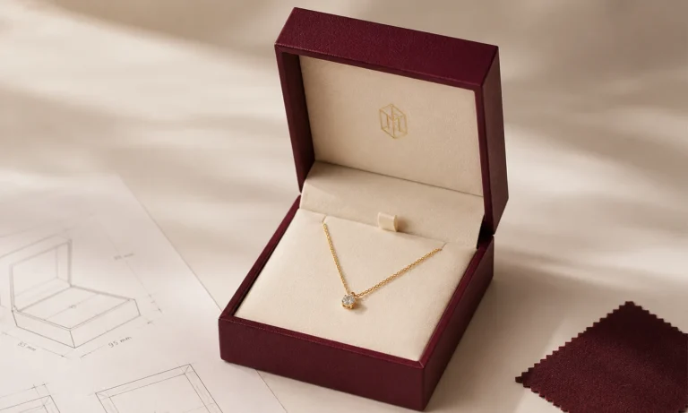
Foil Stamping vs Embossing for Jewelry Packaging: Which Fits Your Brand?

When comparing foil stamping vs embossing for jewelry packaging, the difference is not simply shine versus texture. Both can make a jewelry box logo feel more considered, but they do not solve the same design problem. Foil adds a visible decorative layer, often with metallic color and reflection. Embossing changes the surface itself by raising the artwork, while debossing presses it below the surrounding surface. The final result depends on the material, logo detail, placement, viewing distance, light, and production method—not only on how the effect looks in a digital rendering.
That distinction matters for jewelry packaging. A gold foil logo may be easy to see in a retail display but produce glare in some photographs. A blind embossed logo may feel refined in the hand but disappear under flat front lighting. A deep deboss may look clean on one paper or leather-like surface and lose detail on another.
The best choice is therefore not the finish that appears most decorative on screen. It is the finish that keeps the logo clear, balanced, and repeatable on the intended packaging material under real viewing conditions.
Foil Stamping vs Embossing: The Quick Answer
Choose hot foil stamping when the logo needs visible color, metallic reflection, or stronger contrast with the packaging surface. Choose blind embossing when a raised, tone-on-tone mark and tactile detail support the brand. Choose blind debossing when a recessed, restrained impression suits the material and design language.
None of the three is automatically more premium. Each can look precise or poorly resolved depending on the artwork, substrate, tooling, pressure, temperature, registration, and sample approval.
| Finish | What changes | Often selected for | Main point to verify on a sample |
|---|---|---|---|
| Hot foil stamping | A colored or metallic decorative layer is transferred to the surface | Stronger contrast, metallic accents, visible branding | Coverage, edge definition, reflection, adhesion, and color on the actual material |
| Blind embossing | The design is raised without adding a printed color | Tactile, tone-on-tone branding and light-created relief | Height, edge quality, fine-detail retention, and material distortion |
| Blind debossing | The design is pressed below the surrounding surface | Quiet, recessed branding with shadow and texture | Depth, legibility, edge definition, and whether the mark becomes too subtle |
| Foil with embossing or debossing | Color or reflection is aligned with a raised or recessed effect | A logo that needs both visual contrast and tactile relief | Registration, tooling, material behavior, and consistency across pieces |
This table is a starting point rather than a production specification. The same logo can behave differently when the box wrap, coating, grain, color, or construction changes.
What Hot Foil Stamping Actually Changes
Hot foil stamping uses heat and pressure to transfer a decorative layer from a carrier film to the packaging surface. The transferred area can create metallic shine, pigment color, a transparent effect, or another decorative appearance depending on the chosen foil and process.
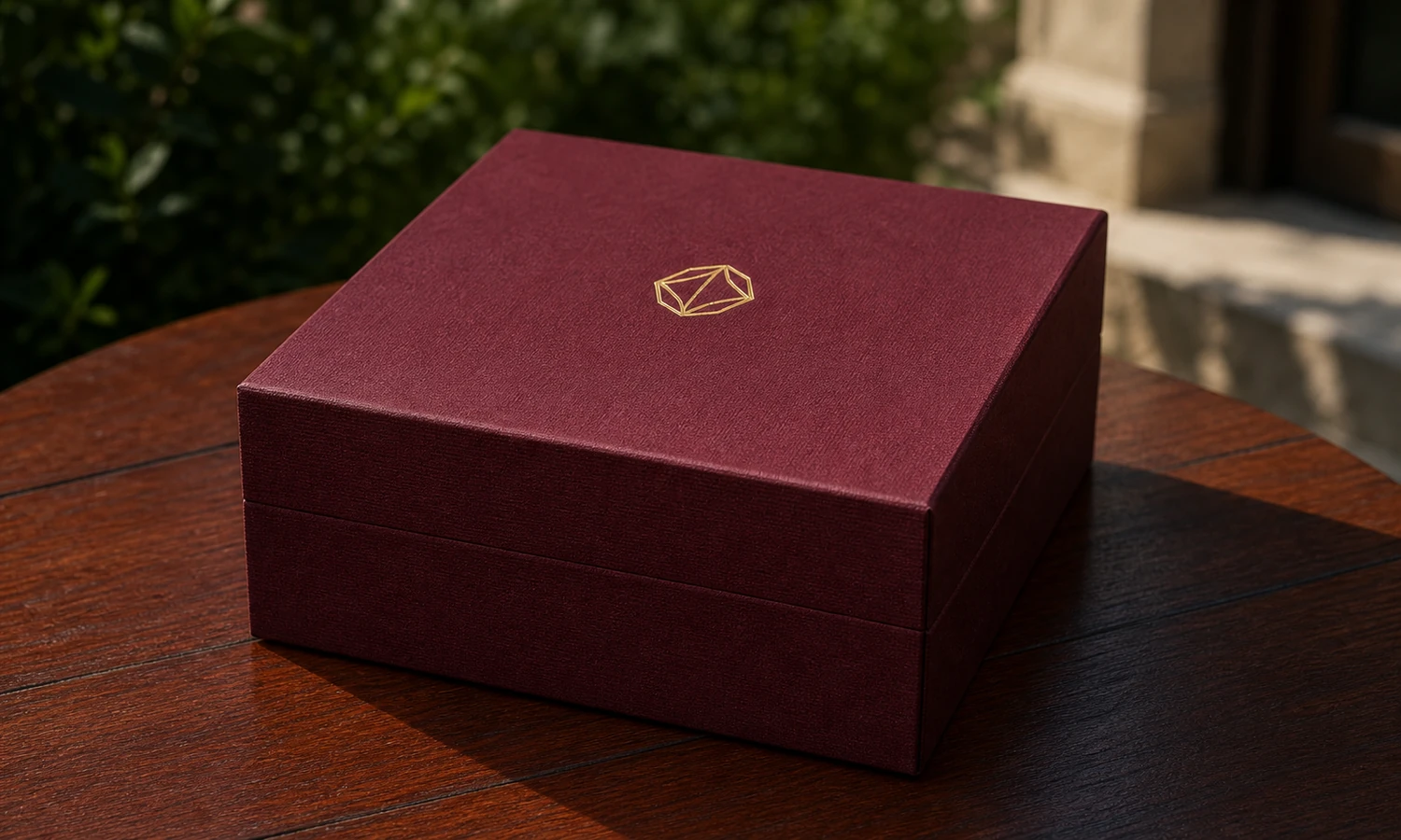
For a jewelry box logo, a common advantage is added visual contrast. A metallic mark can separate from a dark, pale, or saturated background without requiring a large logo. It can also connect the outer box to other branded items such as shopping bags, cards, or ribbons when the color system is managed carefully.
However, “gold foil” is not one universal result. Foil tone, gloss level, surface texture, box color, lighting, and camera angle all affect what the customer sees. A warm gold may support one jewelry collection while a cooler or more muted metallic may fit another. A highly reflective foil may look bright from one angle and dark from another because it reflects its surroundings.
When foil stamping is usually worth testing
Foil is a useful starting option when:
- the logo must remain noticeable from a normal retail or unboxing distance;
- the brand identity depends on a metallic or defined color accent;
- the packaging surface provides enough contrast for the intended logo size;
- the same finish will be used as a controlled accent rather than across an unnecessarily large area.
The sample still needs to prove that the foil transfers cleanly to the chosen surface. Texture, coatings, soft-touch films, grain, and absorbency can change coverage and edge definition. Do not approve foil based only on a digital gold effect or a supplier sample made with a different material.
What Embossing and Debossing Change
Embossing forms a raised design; debossing forms a recessed design. When no ink or foil is added, the result is often called blind embossing or blind debossing. Instead of introducing a new color, these finishes rely on relief, shadow, and the existing surface.
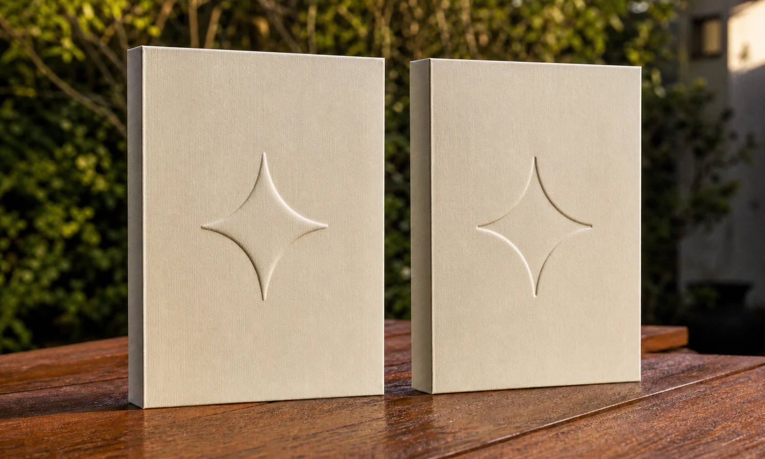
This can suit brands that want the material itself to remain visually dominant. A tonal mark on textured paper, a recessed logo on a leather-like cover, or a subtle raised symbol on an inner panel can feel integrated rather than applied.
The result is also more dependent on touch and light. Side lighting can reveal relief that is almost invisible under flat lighting. A customer holding the box may notice the texture immediately, while the same mark may be difficult to read in a small e-commerce thumbnail.
Embossing is not simply “foil without color”
An embossed mark has different artwork and production limits from a flat foil mark. The material must form around the tooling, and the intended depth must work with the logo size, line weight, surrounding clear space, and packaging construction. Small enclosed spaces in letters (counters), thin strokes, tight gaps, negative or reversed areas, and complex multilevel relief may not reproduce the way a flat vector preview suggests.
Depending on the box construction, the effect may be formed in a paper wrap, cover material, panel, sleeve, or another component. The supplier should confirm where and how the process will be applied before the artwork and box structure are treated as final.
When embossing or debossing is usually worth testing
Consider a blind raised or recessed logo when:
- the brand favors quiet, material-led presentation;
- the box will often be handled at close range;
- tone-on-tone branding is intentional rather than a compromise;
- side light and touch can contribute to recognition.
Embossing and debossing should not be selected only because they are assumed to look luxurious. If the relief is too shallow, the logo may disappear. If it is too deep or too complex for the material, edges and small details may lose clarity. The correct level must be established with the actual design and substrate.
Compare Visibility Before Comparing “Luxury”
The most visible finish is not always the best fit, and the most subtle finish is not automatically the most refined. Start by defining where the logo needs to work.
Retail display and normal viewing distance
If the box will sit on a counter or shelf, a customer may first see the logo from a short distance, before handling the box. Foil or another contrasting finish may provide clearer recognition. A blind embossed mark can still work, but its size, relief, material color, and lighting need to support visibility.
E-commerce and social photography
Foil can create an attractive highlight, but a strongly reflective surface may also show uneven brightness, dark reflections, or glare. Embossing and debossing depend on directional light to reveal depth. Photograph each sample from the intended customer angle rather than relying only on a dramatic macro image.
Unboxing and in-hand experience
At close range, tactile detail becomes more valuable. A blind embossed or debossed logo may feel deliberate even when it is not the first element visible in a photograph. This is useful when the packaging experience is designed to move from a restrained exterior to a more detailed interior.
A packaging system, not one isolated box
A jewelry brand may use rigid boxes, pouches, cards, shopping bags, and shipping components. The visual identity should be consistent, but the production method does not need to be identical on every material. A metallic logo on a paper box, a printed mark on a pouch, and a blind deboss on a leather-like case can belong to one system if their scale, placement, and color logic are coordinated.
Select the Packaging Material Before the Logo Finish
Material selection and logo finishing should be developed together. A finish approved on smooth coated paper cannot be assumed to perform the same way on textured paper, soft-touch lamination, fabric, PU leather, genuine leather, wood, or another surface.
Buyers can compare jewelry boxes by material before locking the logo process. The material page is useful for narrowing the box family, but a project-specific sample is still required for the final surface and finish combination.
| Packaging surface | What to discuss before approval |
|---|---|
| Smooth paper wrap | Coating compatibility, foil color, relief depth, edge definition, and final box color |
| Textured or porous paper | Whether the texture interrupts solid foil coverage or softens small embossed details |
| Soft-touch or film-laminated paper | Transfer compatibility, heat and pressure response, marking, and surface changes around the logo |
| PU leather or leather-like material | Grain, finish compatibility, edge clarity, color contrast, and which option should be sampled for clearer and more consistent reproduction |
| Fabric or velvet | Whether the intended process suits the weave, pile, backing, and construction—or whether a label, band, plaque, or inner-lid mark is more practical |
| Wood or metal component | Whether a different branding process and tooling should be evaluated instead of assuming paper-box methods will transfer directly |
These are decision prompts, not universal compatibility rules. Suppliers should confirm the process for the exact material specification, surface treatment, box construction, logo, and order requirements.
Prepare the Logo for the Process, Not Only for the Screen
A logo file that looks correct in a presentation deck may not be production-ready. Foil, embossing, and debossing use tooling and process-specific artwork, so the supplier needs a clean, scalable master rather than a screenshot or low-resolution image.
Send editable vector artwork
Provide the logo as editable vector artwork in a format accepted by the supplier, such as AI, EPS, or vector PDF. Preserve a master version before outlining type or simplifying details. A vector file allows the logo to be sized accurately and converted into production artwork without tracing a raster image.
Create a one-color production version
Gradients, transparency, photographic texture, and fine tonal changes do not translate directly into a single foil or blind relief. Prepare a positive, one-color version that clearly shows what is stamped. If the original logo relies on several colors or very fine shading, create an approved packaging variant rather than allowing an unplanned simplification during prepress.
Specify the final size and placement
Do not send a logo without dimensions. Record its final width or height, position from relevant edges, orientation, and relationship to closures, seams, lid edges, ribbons, or other elements. A logo that works on a large shopping bag may need a different approved size on a ring box.
Ask for process-specific limits
There is no reliable universal minimum line width, gap, type size, or relief depth for every material and machine. Ask the supplier to review thin strokes, small counters, reverse areas, tight letter spacing, and broad solid areas against the exact substrate and finish. If detail must be enlarged or simplified, approve that change before tooling.
Define the finish precisely
“Gold” or “embossed” is not a complete instruction. For foil, record the approved foil reference, color family, gloss level, and sample. For embossing or debossing, specify whether the surface is raised (embossed) or recessed (debossed), and whether the effect is blind, meaning no ink or foil is added. Where applicable, record whether the relief is flat or multilevel and how it should align with printed or foiled artwork.
When Foil Is Combined with Embossing or Debossing
Foil can be combined with embossing or debossing when the logo needs both color and tactile depth. This can create a strong focal point, but it also makes registration and tooling more important. The colored area and the raised or recessed area must align closely enough for the intended design, and the material must tolerate the selected process.
A combined finish is most useful when the relief adds a clear function to the artwork—for example, giving a simple emblem controlled dimension—rather than being added because more finishing is assumed to be better. Additional foil colors, passes, tooling, stamped area, and sample revisions can also affect cost and production planning.
Ask the supplier whether the design will be completed in one operation or multiple operations, what registration tolerance is realistic, and which sample will become the approved reference. If a flat foil logo already achieves the required visibility and brand feel, additional relief may not improve the result enough to justify the complexity.
A Practical Decision Framework for Jewelry Brands
Use the following sequence before selecting a finish:
1. Define the job of the logo
Decide whether the mark must create immediate contrast, reward close inspection, communicate through touch, match another packaging item, or remain intentionally quiet. A finish cannot be evaluated fairly until its job is clear.
2. Confirm the final surface
Choose the actual material, color, texture, coating, and relevant box component. Do not compare finishes on generic white card if the production box will use textured green paper or a grained leather-like cover.
3. Test the real logo size
Use the intended dimensions and placement. A large supplier demonstration mark cannot prove that a small jewelry box logo will retain the same detail.
4. Review the intended viewing conditions
Check the mark under front light, side light, normal room light, retail-style lighting where relevant, and the photography setup used by the brand. View it at a normal distance as well as in close-up.
5. Compare total production needs
Discuss tooling, foil or finish selection, number of passes, stamped area, registration, sample revisions, quantity, and repeat-order controls. Request a project-specific quote instead of assuming one process is always cheaper.
6. Approve a physical standard
The approved sample should be paired with a written specification. Record the material, color, coating, finish, foil reference where applicable, artwork version, dimensions, placement, and any agreed acceptance points.
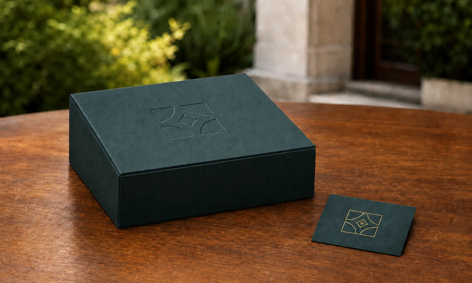
Logo-Finish Sample Approval Checklist
A physical sample should answer the questions that a rendering cannot. Whenever practical, compare foil, embossing, and debossing using the same logo size and the exact intended material. If a temporary comparison uses a substitute, record the difference and resample on the final production material before approval.
- Confirm that the sample uses the intended material, color, texture, coating, and construction.
- View the logo under front and side light, check it at the normal viewing distance, and photograph it with the brand’s usual setup.
- Review thin lines, small counters, reverse areas, tight spaces, and broad solid areas.
- Check foil coverage, gaps, unwanted marks, edge definition, and reflection consistency.
- Check embossed or debossed depth, edge clarity, shadow, material distortion, and detail retention.
- Confirm the logo size, orientation, and distance from other elements, then handle the sample as it will be opened, packed, photographed, or displayed.
- Compare more than one piece when consistency is important; one successful impression cannot define the full production range.
- Record the approved artwork, tooling reference, finish specification, and physical sample, and define which later changes require resampling.
When these points need to be checked before bulk production, request a packaging sample and be ready to share the intended logo artwork and material specification with the project team. Sample availability, charges, timing, and revision scope should be confirmed for the individual project.
Common Logo-Finishing Mistakes
Choosing from a screen rendering alone
A rendering can communicate position and general color direction, but it cannot prove reflection, tactile depth, surface coverage, or real material behavior.
Selecting the finish before the material
The same artwork can change when the substrate, grain, coating, or box construction changes. Resolve the surface and finish as one decision.
Approving only the best viewing angle
A finish should be reviewed from the angle a customer will normally see it. A dramatic side-lit photograph is useful for showing texture but should not be the only approval view.
Leaving production tolerances undefined
An attractive sample is more useful when it is supported by a written specification and agreed acceptance points. Record what must remain consistent and what changes require resampling.
Frequently Asked Questions
Is embossing better than foil stamping for luxury jewelry packaging?
Not automatically. Foil can provide color and strong visibility, while embossing can provide tone-on-tone relief and tactile detail. The better option is the one that fits the brand, material, logo, viewing conditions, and approved sample.
What is the difference between embossing and debossing on a jewelry box?
Embossing raises the design above the surrounding surface. Debossing presses it below the surface. Both can be produced without added color as a blind finish, or may be coordinated with other printed or foiled elements depending on the design and production method.
Can a jewelry box logo use foil and embossing together?
Yes. Foil can be combined with embossing or debossing when both visual contrast and relief are required. Registration, tooling, material behavior, artwork detail, and consistency should be confirmed with a physical sample.
Does foil stamping work on every jewelry packaging material?
No single foil or process should be assumed to work the same way on every paper, coating, fabric, leather-like material, wood, or metal component. The supplier should confirm compatibility and test the exact surface intended for production.
What artwork should I send for foil stamping or embossing?
Send clean editable vector artwork, an approved one-color production version, final logo dimensions, placement instructions, and the intended packaging material. Ask the supplier to flag details that may need adjustment for the selected process.
Choose the Finish That Works on the Real Package
The right comparison is not foil versus embossing in the abstract. It is foil, embossing, or debossing on the intended material, at the intended logo size, under the conditions in which the customer will see and handle the package.
Start with the brand objective and surface, prepare process-ready artwork, and use a physical sample to confirm visibility, texture, detail, and repeatability. If you are ready to compare materials, structures, and logo finishes as one system, build your own jewelry packaging and be ready to provide the logo artwork, target placement, preferred surface, and the questions the sample must prove.